
The 10 best financial charts in the 🌎 (according to me)

I've always wanted to have a cool LinkedIn banner. My good friend and software/computer wizard Pedro Dutra might have the best one I've ever seen. Behind his profile sits depictions of his work, in a beautifully organized and bright, exciting fashion.
That works for a software guy who writes code and makes things look cool. But for a guy in finance like me, not so much. Finance shouldn't be flashy, bright or exciting. It should be be the opposite; concise, simple and almost boring. Especially to people who aren't super interested in staring at numbers on little screens like me.
People don't like the numbers in finance because it's hard to extract meaning from them. A video game character with guns a' blazing might draw you in instantly, but you'd be hard pressed to find anything unsexier than MS Excel 2007.
There is one way in which the bellows of finance poke themselves out for instant, maybe even exciting interpretations. I don't know about you, but for me few things in life beat blasting a country song with the windows rolled down, that first sip of morning coffee, or a beautiful financial chart.
I think charts get hate because most things that are on them don't need to be charted to begin with. Yes, we know earnings fell 8% last quarter and shareholders demand answers. Yes, we know the search engine trends for Jayson Tatum jerseys are rising rapidly. Lots of charts could have been in an email, a short text or just assumed to exist.
BUT every once and awhile a chart comes along so good it defies these structural odds. Especially in finance, a good chart is like a senior thesis on half a page. It could take millions of pieces of data, data that lives in those unsexy cells of Excel 07, and shape them into a concise, informative, and dare I say exciting story. As the saying goes, if a picture tells a thousand words a chart must tell billions.
What I think is even cooler about financial charts (the good ones) is they simplify something extremely complex, and show us exactly why it matters. All in the course of 30 seconds of looking at it. If finance really is just a mirror to the world we live (in the quantitative sense) then good financial charts are the selfies every economic participant has taken in said mirror over time.
If I haven't sold you enough on charts yet, have a look at my new LinkedIn banner. Yup, it's charts. All 10 of them being my absolute favorites.
In the creation of this design, I had to go through every chart I owned. For most people that would be a 2 minute process. It easily took me 4 hours. Two years of writing for yourself and you'll have tens of thousands of charts in your phone too. Saved in folders like CHARTZ, all-time greats, writing source, and more. Charts of everything from the price of a McDouble over the years to the German stock market before, during and after Hitler's invasion of Poland. I reiterate that good charts come alive, they tell a story, and they are reference tools to explain the business world.
So by popular demand, I am going to show you these 10 charts that my friend spun together to create my new banner. I'll explain exactly what each is telling us, and why that story matters. Hopefully, they will help you leave this article with a better understanding of our world (from the lens of exciting finance).
Let's begin.
CHART 1: THE DISTRIBUTION OF STOCK MARKET RETURNS
Most stocks suck. That's what this chart tells us. If you've ever heard the notion that picking stocks is a fool's errand, this chart is for you. Let's break it down.

This chart shows the distribution of returns for S&P 500 stocks from 2000-2020. The horizontal axis displays the total percentage return of any given stock. The vertical axis shows the percentage of all stocks that fell into each return category.
Two lines are included, showing the median stock return and S&P 500 return over the same period. The majority (75%) of the frequency falls to the left of the index return, meaning 75% of stocks don't beat the broad index. Why is that? Your answer lies on the far right of the chart.
I don't care what you've heard. The truth is that a small percentage of very high-performing stocks deliver almost all of the market's returns. It's similar to how a very small number of high-performing athletes become legends, or how a select few professional artists (often after they've died) are responsible for most art industry revenue.
As you think about it more, you'll likely come up with other areas of life where distributions are asymmetrical and positively skewed. A few more examples: a handful of countries control most of the world's oil, a select few actors consistently win Oscars, and the average content creator only makes a modest salary. But this is about stocks.
Many of us know what owning one of those exceptional winners feels like. Personally, I've made more money in Tesla, Nvidia, and Costco than I ever should have. Yet, for each of those, there was Peloton, PayPal, and Enphase Energy – stocks that returned significantly less than the market, nothing at all, or lost value completely. This game is not easy.
So that's your takeaway from Chart 1. Your chances of picking the best stocks – the ones that drive all the market returns – are exceedingly low. This is not only because it requires you to correctly predict the future (Tesla was close to bankruptcy at one point) but also because you're locked in an ever-recalibrating bit of game theory with every other investor in the same markets as you.
Pick stocks? At your own risk.
CHART 2: VENTURE CAPITAL RETURNS VS. LEGO SET RETURNS
As I've gotten older, I've fallen in love with Legos once again. I had more or less called it quits on the world's greatest toy by age 9 or 10. The tubs full of pieces got donated by mom, any remaining sets got dusty, and priorities shifted to other things. Still, about 10 years later I decided to pick it back up.
Since then, I've bought myself a Lego set every year. A treat to myself, and a reminder that although we try (in my own experience, sometimes really hard), we never fully leave parts of childhood. Legos are also interesting from a business perspective and hence an investing perspective. Did you know that the Lego Group is still controlled entirely by their original founder's descendants? That's a private stock I wish we could buy.
As you'll also know - I'm a public markets only guy. The three major classes of non-public market investment vehicles (at least by AUM and notoriety) are private equity, hedge funds, and venture capital. Technically, venture capital is a subset of private equity and hedge funds can dabble in it too, but for our purposes the three are distinct.
For the interest of brevity in this article I'll give hedge funds a break. Some of history's greatest investors were hedge fund magnates, and hedge funds do operate in the public markets (especially if you're Bill Ackman - who started a hedge fund with nothing but Target calls in it). In my eyes, venture capital and private equity (especially private equity) deserve much less respect. My thoughts on how private equity slaughters, skins, harvests and leaves a business as nothing more than bones... is a story for another time.
Venture capital is a little better, I guess. But then again, these are the people who gave Sam Bankman-Fried billions in funding after a Zoom call with him during which he was actively playing League of Legends (props to the guy, sometimes the wool is already well over the eyes).
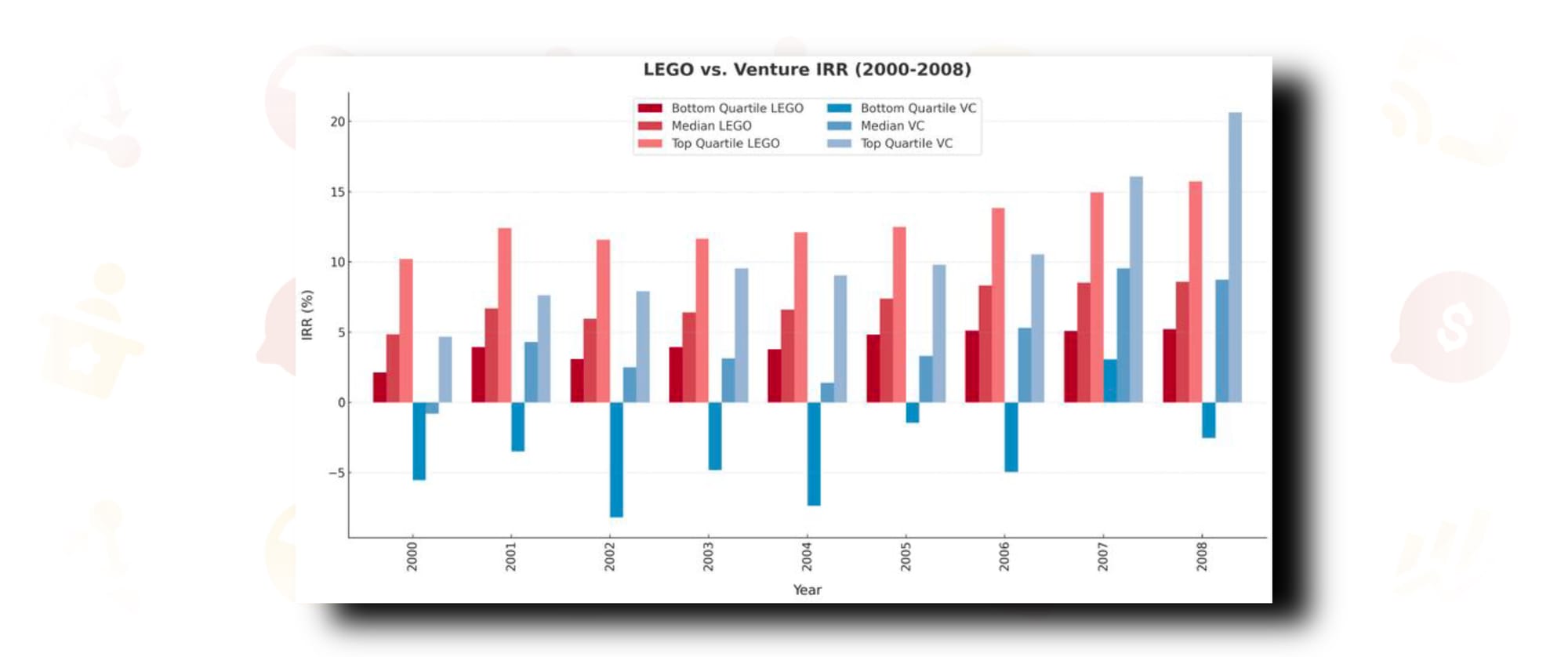
My second chart here ties my disdain for venture capital by comparing it with Lego sets. Yes, you heard that right. You also heard that the entirety of the venture capital industry (at large average) performs no better than 8-year-old me after a trip to the LEGO store with grandma's credit card.
CHART 3: DOES MONEY BUY HAPPINESS?
Have you thought about this one? Pit Bull says it does if you give it away, and there's some truth to that. There's also truth to the actual notion that money does buy happiness, up to a certain point. At this point, that can either be net worth (a billion dollars to manage or whatnot) or a level of income. Studies have been done on this, and one of my favorites from Matthew Killingsworth is our chart #3.
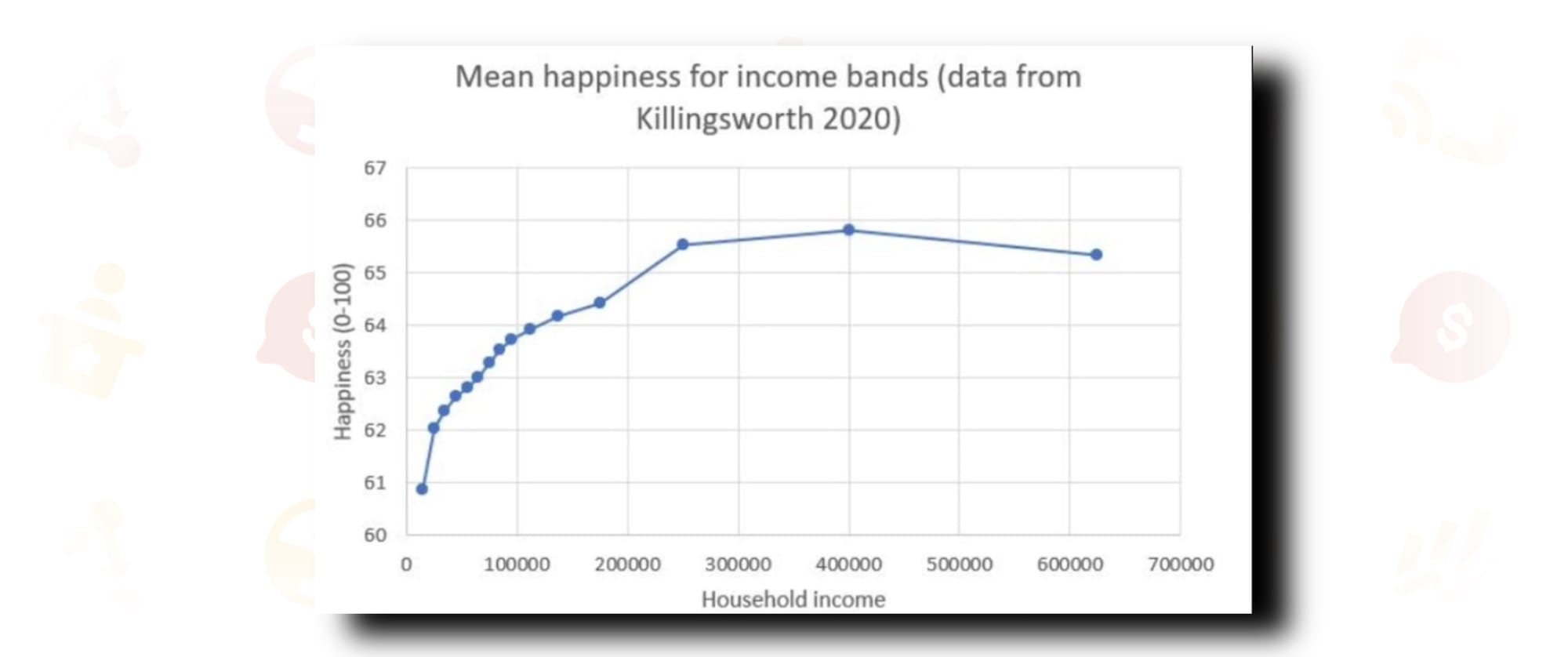
The empirical answer to the age-old question is yes, with a notable caveat. Just like anything else in life - the law of diminishing returns applies. For the households studied, marginal extra income past a certain point (~$300,000/yr.) did much less for happiness than additional increases before it. I'm sure it also doesn't help household happiness that any income over 385k goes back to the IRS at a rate of 32 cents per dollar.
CHART 4: POLITICAL POLARIZATION AND MARKET PERFORMANCE
I normally don't talk politics, but I will this one time for the sake of this article. Chart #4 is for everyone who thinks the extreme left is crazy, the far right is nuts, and our politicians are way too old. It's for everyone like me who thinks that we are much more similar than we are different - that most Americans aren't racist, godless, or completely lost.
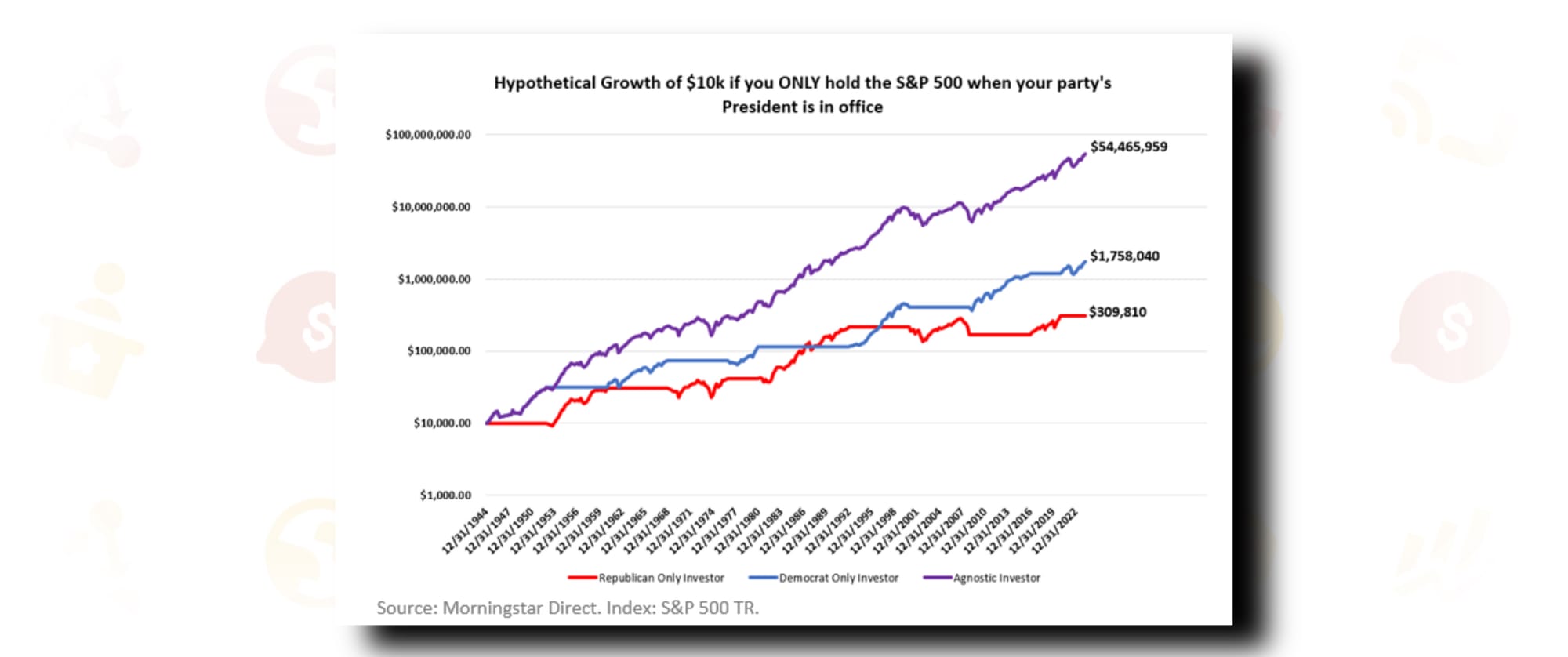
One of the most beautiful things about the public markets (to me) is that they put all internal biases to rest. The public markets don't care if you voted for Trump or are knocking on doors for Biden. The public markets don't care if you couldn't stand Obama or threw that famous shoe at George Bush.
The public markets do what America has done for centuries, regardless of political inclinations. Our markets simply go up - and betting against that for any reason, be it political, emotional, or economical, is an incredibly stupid thing to do.
CHART 5: U.S. VS. INTERNATIONAL STOCK PERFORMANCE
There's a few things I think the current, at-large investment industry does incredibly poorly. The majority of professional and academic finance roots itself deeply in a belief that past returns are not predictive of future results. I think this sometimes leads to an easy cop-out from making the call that certain markets (or individual stocks) are better than others, because there's always a chance you'll be wrong. No one likes to be wrong, and if you can chop things up to theory whichever way reality turns, you'll always look smart and never be really that incorrect. Those should be mutually exclusive, in my opinion.
My two biggest crusades in this area have to do with portfolio construction, and I know because I've taken millions of dollars from other portfolio constructors. The first, which I won't get into now, has to do with the idea of value versus growth. The other has to do with international investing. In the simplest way I can frame it, I don't think there is any convincing evidence that stocks from outside the United States perform better, or offer any real diversification benefits from stocks that are domestically traded.
I'll give you the rationale for that in a later chart, but here's the real, concrete history. U.S. is in green. Europe and Emerging Markets make up the rest.
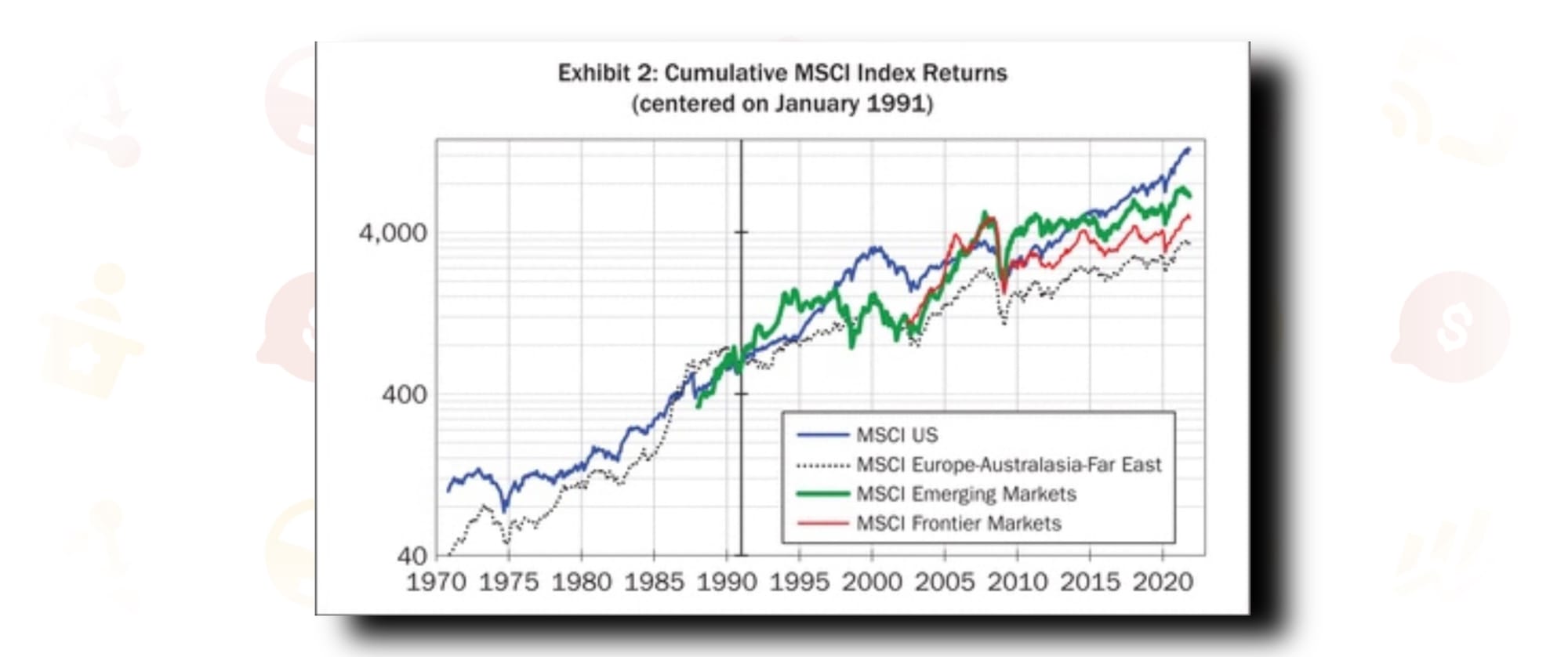
Not to mention we have incredibly inconsistent data for international indexes prior to 2000...I'll rest my case. I invest my money in one place and one place only - domestically listed American stocks.
CHART 6: EVOLUTION OF U.S. STOCK MARKET SECTORS (1800-2023)
I have no idea how one gets market data from 1802. Although it is well documented that markets of exchange have been a pillar through human history, the change in these markets over time has been a point of fascination for me. Did you know that in 1800 the only publicly traded companies were industrial and financial? The remaining 9 sectors of the S&P 500 index didn't even exist yet. The entire New York Stock Exchange (NYSE) consisted of 30 combined stocks and bonds.
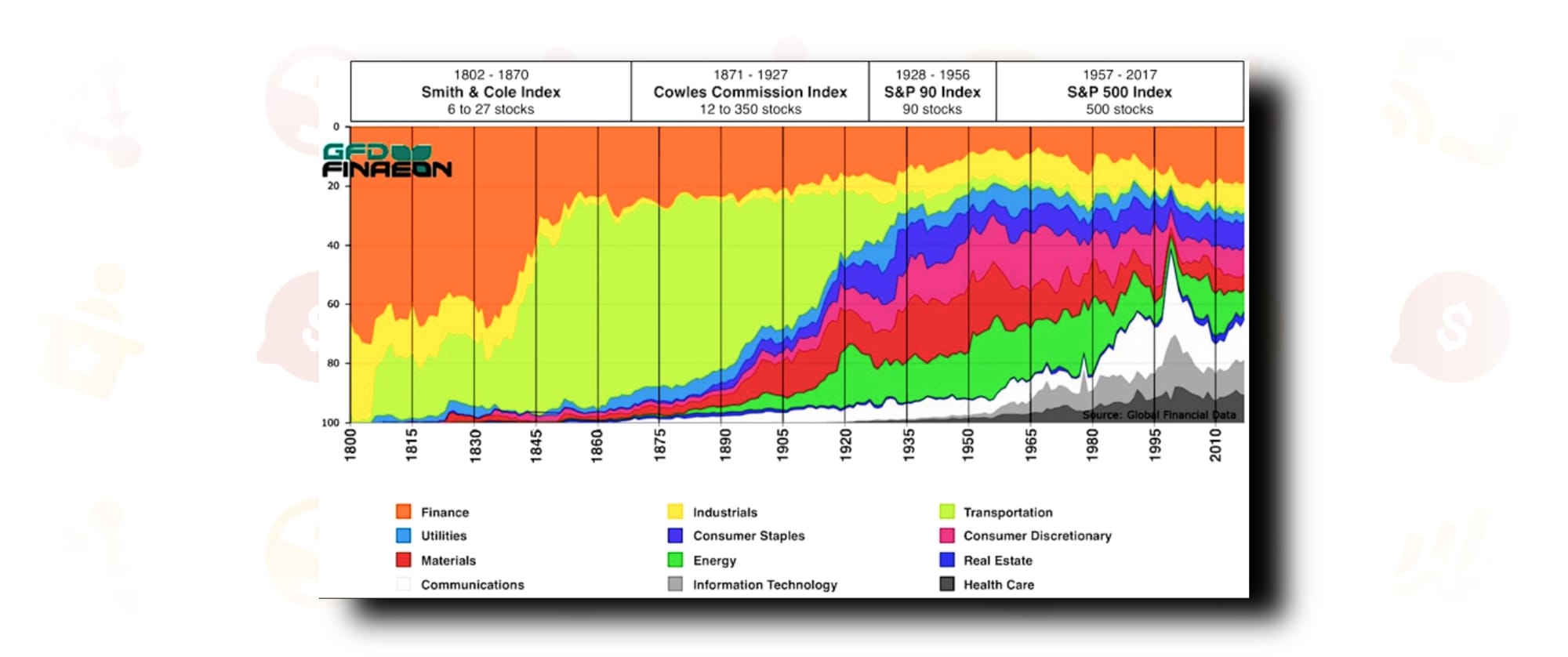
Fast forward to 1870, and we now have 7 sectors of the market: finance, industrial, energy, utilities, materials, staples, and discretionary. Chart 6 shows you these changes in real market data over 2 centuries. It shows how the economy of today is never the economy of yesterday, and affirms the notion that business and the markets are living, growing things.
What will the market look like in 200 years? Who knows, but I can’t wait for my great grandchildren to find out.
CHART 7: HOUSING COSTS ADJUSTED FOR SQUARE FOOTAGE
The first real economics book I read was "Freakonomics." If you haven't read it, I highly recommend it. There's also a podcast, which I've linked here. The premise is simply that economics is a much wackier science (if you can call it that) than we give it credit for. The series explores how commonly accepted economic wisdom often has more nuanced and lurking explanations beneath it. It dives into how the exact opposite of what we think causes something is its actual proponent and how sometimes the best answer is the stupidest one. It's awesome and I think more investors should listen to it.
I loved Freakonomics most for that exact reason - its relentless quest to put the conventional wisdom to shame. I find that the conventional wisdom is so often wrong, and professionals can spend decades believing something that simply isn't true. One of the biggest misconceptions that I've come around to is that housing in the United States of America is expensive. We've all seen the charts about home prices versus wage growth. We know that story, and it's conventional wisdom to say it can't get any worse.
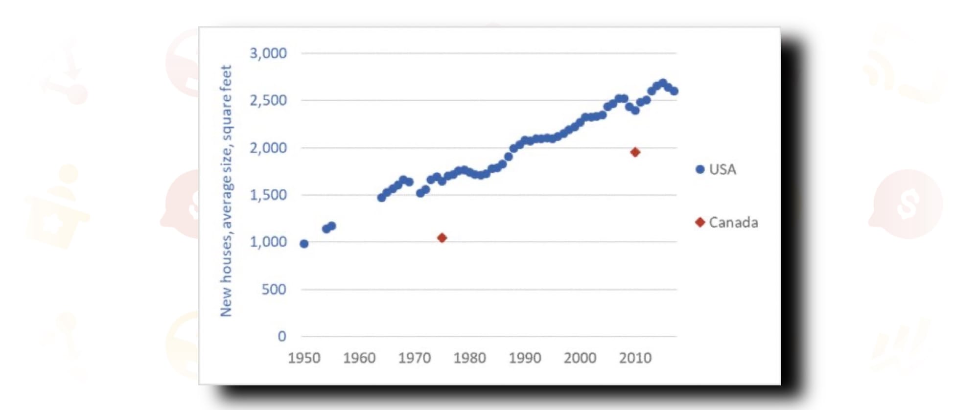
Well, what if we adjusted for a lurking variable, maybe like the square footage of the house? Bigger things cost more, right? In 1950 the average square footage of a single-family residence (SFR) in the United States of America was under 1000. In 2015 it was 2500. If you regress the increase in housing costs against this increase in footage, it explains the statistical majority of higher prices. It's not that houses are more expensive; actually, on a per square foot basis, people are paying less. It's that people are just buying bigger houses, and that's all you need to know (and is also chart #7).
CHART 8: CORPORATE EARNINGS AND STOCK MARKET PERFORMANCE
What are the top 5 things that determine stock prices? I'll give you a second to ponder. Lock those in in 3, 2, 1. Now,what if I told you it isn't a single one of those? It's not the economy, or Nancy Pelosi, or how much debt the Federal Government has. What if I told you there weren't even 5 to write? Or even 3? You'd say no way.
Warren Buffett's mentor Benjamin Graham wrote almost 100 years ago that the stock market is a voting machine in the short term and a weighing machine in the long term. This confirms later work by academics such as Burton G. Malkiel that short-term stock prices follow the random walk pattern and cannot be accurately forecasted.
Piggybacking on the idea from our previous discussion that sometimes things are stupid simple or you're simply stupid - there's really only one thing that matters for the stock market in the long run.
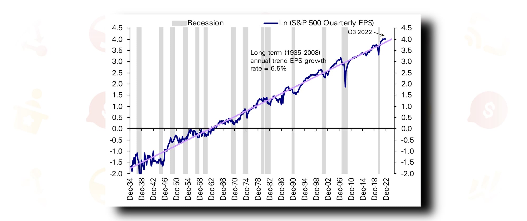
Since December of 1934, S&P 500 company earnings (in aggregate) have grown at an annualized trend of 6.5%. While 15 recessions (one every 5.86 years on average) have occurred over that same period, corporate earnings have shown remarkable resiliency. In chart #8, the pink line represents that 6.5% trendline- and the blue line shows the actually reported earnings. If you look very closely, the earnings chart looks strikingly like the S&P 500 stock chart itself. After factoring inflation over the same period, the S&P 500 has returned…drumroll please, 7% per year. One thing matters for stock prices, and it's company earnings.
CHART 9: S&P 500 GEOGRAPHIC REVENUE BREAKDOWN
Whoever said you need to own international stocks doesn't even understand the U.S. stocks they are investing in - or they are straight up lying to you. I'm sure many of you are familiar with the acronym BRICS (Brazil, Russia, India, China, South Africa) - a supposed economic bloc set to rival the American-led economy of today. What you likely don't know, however, is that the BRICS acronym doesn't come from politics or economics or even history. It comes from Wall Street.
In late 2001, a Goldman Sachs analyst by the name of Jim O'Neill wrote an investment thesis for international and frontier economies. This research was supposed to supplement Goldman's aggressive push into international funds they were set to sell clients. Funds that conveniently made them more than a similar U.S. fund might.
In his write-up, O'Neill coined the term BRIC (South Africa was added later) to describe said opportunities. As we've shown earlier, there's no convincing evidence that non-U.S. investments perform better than U.S. investments. The reason for that will continue to be so.
Apple derives 58% of its revenue from overseas. Europe and Asia make up over 48% of Google's business. 20+ years of globalization have birthed the American multinational in a way that I believe is severely under-appreciated.
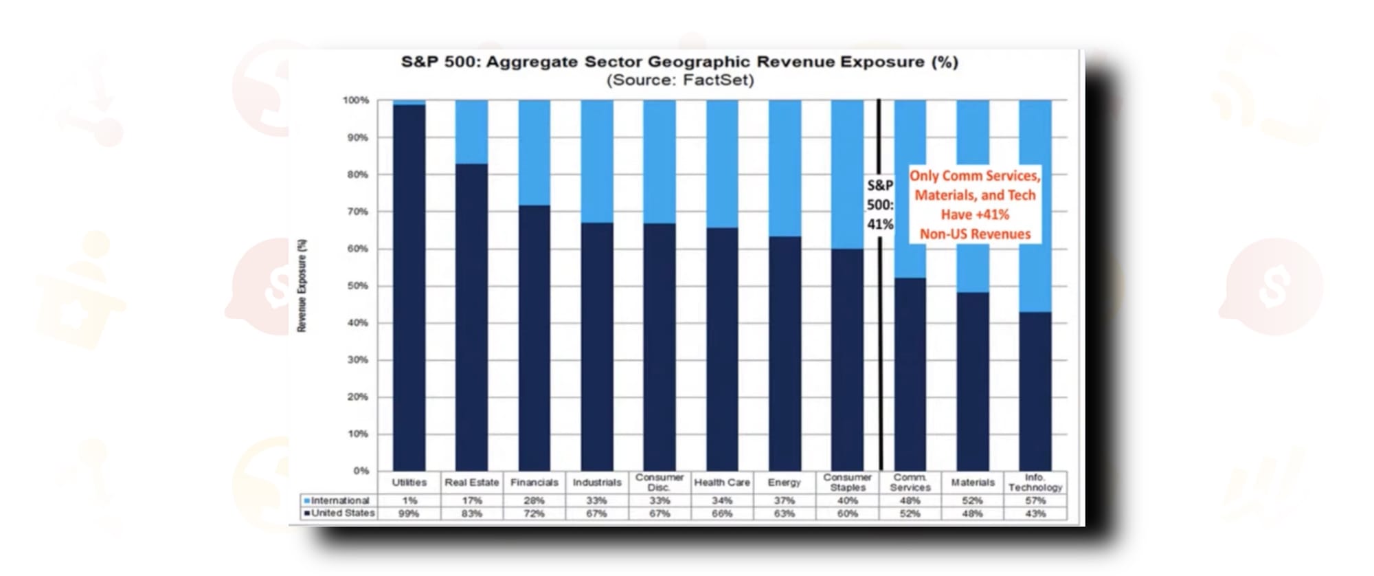
Chart #9 breaks down each of the 11 S&P 500 sectors by geographic revenue share. As you can see, 2 whole sectors have more international revenue than domestic revenue (materials and info tech). As a whole, a whopping 41% of S&P 500 net revenues come from overseas. For the Nasdaq 100 it's even higher, at almost 50%. It should come as no surprise either that materials stocks have exhibited a 0.79 correlation with emerging market indices since 2003.
CHART 10: WEALTH DISTRIBUTION IN AMERICA
And here we are at #10. Thank you for spending your time on this today. I hope it has provided insight, a few chuckles, and hopefully a renewed interest in finding favorite charts of your own.
All I ask is that if you took value from this, you make sure to subscribe below (it's totally free) to the new Market Dispatch. We've been hard at work building out an entire personal finance and investing news source that is both engaging for audiences and empowering for creators.
If you are interested in becoming a contributor and having your work read by thousands of readers like yourself, we are still looking for additional part-time contributors.

The title says it all: to be wealthy in America is to own stock. For everyone else, the home is the most important asset and investment you'll make. Keep it in mind.
Ok team, that's all I've got for you today. I'll leave you with my 3 core investing philosophies-the things that underpin everything I believe about capital markets and financial success.
Economics, politics and emotions have no place in investment decision making.
The best time to get started was yesterday, the second best time is today.
Buy U.S. stocks and never sell them.
Oh, and you can also now become an Insider to get my writing (and every other outstanding contributor's) delivered right to you inbox in a weekly Dispatch. We'll even send you updates and exclusive content for joining the team. See you there.


Comments ()